Rosa Kirk-Davidoff 1 Lucia Wiggers 1
1Department of Geosciences, Williams College, United States, MA 01267
*Corresponding Author Email: lcw3@williams.edu …
Highlights
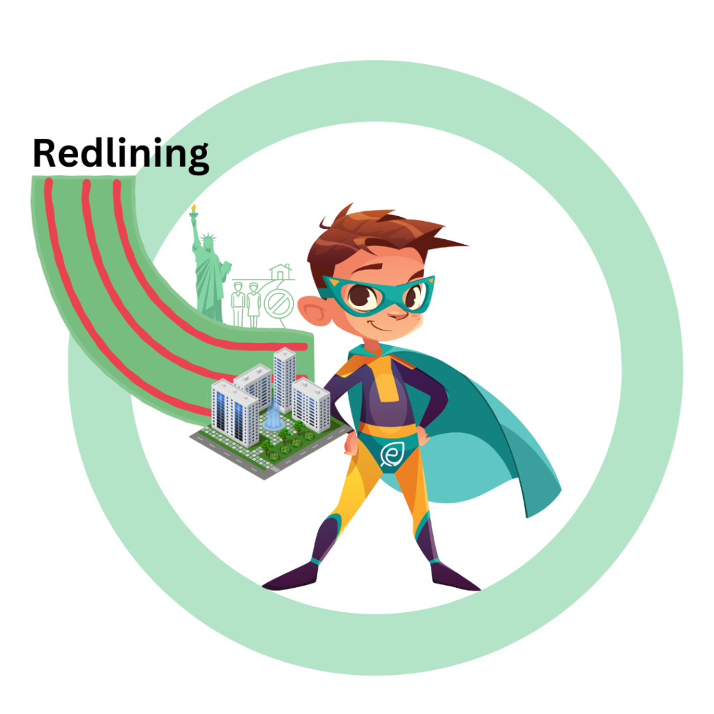
- The 1968 Fair Housing Act banned redlining but the legacy of this historic discriminatory housing policy still haunts many Americans living in urban areas
- People living in urban neighborhoods with extreme poverty and higher racial diversity are more likely to be exposed to high heat compared to wealthier and whiter communities
- Communities of color and resource-limited residents in urban areas tend to have lower tree canopy and higher percentages of impervious surface
- The connections between tree cover and temperature show that the problem of urban heat islands is solvable
- Investments in green infrastructure that are made with grassroot community support, neighborhoods can become greener, cooler, and healthier
Graphical Abstract
Abstract
The impact of green space, or lack thereof, on the surface temperature of cities has long been studied through the Urban Heat Island effect. However, the extent to which the historic discriminatory housing policy of redlining influences the temperatures of different neighborhoods in the same city is still being revealed. Here, the researchers investigated how Home Owners’ Loan Corporation (HOLC) maps correspond to land surface temperatures through uneven distribution of tree canopy and impervious surfaces in New York’s Capital District. Using HOLC maps for Albany, Troy, and Schenectady, the researchers calculated percent tree cover and imperviousness for each of the map’s graded blocks, and calculated the land surface temperature for each block using Landsat 8 imagery. Results showed that neighborhoods rated “hazardous” were generally hotter, more impervious, and less tree-covered than those rated “best” in Albany and Schenectady, but not in Troy. The difference between blocks rated “hazardous” and blocks rated “best” was +2.67°C in Albany, +4.18° in Schenectady, and -1.18° in Troy. These results are an example of how discriminatory housing policies are tied to a disproportional distribution of urban heat. Affected communities, like those in the Capital District, should be identified to increase resilience to the environmental, physiological, and social impacts of climate change.
Keywords: Urban Heat Island Effect, Redlining, New York, Housing Policy, Green Space, Urban Tree Cover.
1. Introduction
Due to anthropogenic climate change, extreme heat events are surging in frequency, duration, and intensity across the United States and the globe, increasing the likelihood of dangerous heat events hazardous to human health. Heat hazards are magnified in urban areas, where the Urban Heat Island effect means that temperatures are usually
higher than in rural areas. Urban heat islands are the result of the high number of dark surfaces such as parking lots, which absorb heat, the low number of trees and vegetation to provide shade, and the large number of buildings constructed using non-reflective material such as concrete and glass (Ullah et al., 2023). Today, city centers often have fewer trees and more paved surfaces than other neighborhoods, causing temperature differences within cities (Hoffman et al., 2020). Due to the historic discriminatory practice of redlining, these downtown neighborhoods are often predominantly home to low-income communities of color (Ramsay et al., 2023). In the 1930s, the Home Owners’ Loan Corporation (HOLC) created “Residential Security” maps that designated neighborhoods as “best”, “still desirable”, “definitely declining”, and “hazardous” for real estate investments. These neighborhoods were colored green, blue, yellow, and red, respectively, based on subjective qualities such as racial makeup and occupation. Home loans were then given selectively based on these rankings, leaving many minority communities with fewer resources than majority-white neighborhoods (Nelson et al., 2021).
While the 1968 Fair Housing Act banned redlining, the legacy of this historic discriminatory housing policy still haunts many Americans living in urban areas (Hoffman et al., 2020). The communities deemed “hazardous” remain predominantly low-income communities of color compared to the higher-ranked neighborhoods, and the limited real estate investment over time has severe effects on the quality of life for redlined communities. Nowak and Greenfield (2018) showed that communities of color and resource-limited residents in urban areas tend to have lower tree canopies and higher percentages of impervious surface, resulting in hotter, more polluted air. Hamstead et al. (2016) investigated the influence of land use on surface temperatures by classifying the land cover of New York City at 3-metre resolution and calculating the range of LST represented in each class. Their study found that these urban areas have distinct differences in temperature based on their land cover classifications. Another study, Voelkel et. al. (2018), found that people living in urban neighborhoods with extreme poverty and higher racial diversity were more likely to be exposed to high heat compared to wealthier and whiter communities, highlighting the extent to which urban climate change affects different socioeconomic and racial demographics in disparate ways.
This study purposes to add to this body of literature by studying how urban green space (or a lack thereof) in the Capital District of New York has affected surface heat temperatures in historically redlined neighborhoods compared to their greenlined counterparts. Our case study includes the three cities of Albany, Troy, and Schenectady (Figure 1). According to HOLC data, at the time of the creation of the residential security maps in the 1930’s and 1940’s, the majority of “definitely declining” and “hazardous” neighborhoods (C and D blocks) in these cities were composed of foreign-born Italian, German, and Polish populations. The A and B block neighborhoods, on the other hand, were described as having a low foreign-born and African American population and residents with mostly higher paying jobs (Nelson et al., 2021). 2010 Census data shows that the non-white populations in these cities are now predominantly African American or Hispanic or Latino (U.S. Census Bureau, 2010). We hypothesized that the historically designated D blocks, where these minority communities are more likely to be located, would have higher land surface temperatures, higher percentages of impervious surface, and lower percentages of tree cover than historically designated A blocks.
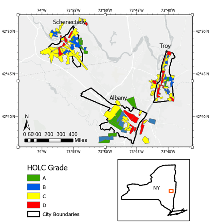
Figure 1: The Capital District. The three cities in the case study are shown, with city limits outlined in black and HOLC Residential Security maps overlaid on the city limits. Since HOLC maps show only residential neighborhoods, they do not completely align with true city limits. Figure constructed by authors using University of Richmond’s Mapping Inequality database and ArcGIS basemap.
2. Methodology
2.1 Data Sources
For redlining maps, we used the University of Richmond’s Mapping Inequality database to download shapefiles of HOLC maps for Troy, Albany, and Schenectady. We then took tree cover and impermeable surfaces data from the National Land Cover Database. Since these records were from 2016, we used temperature data from 2016 to ensure an appropriate comparison. We chose a LandSat 8 image from June 25, 2016 that shows the entire Capital District with no clouds. This was downloaded using the USGS Earth Explorer.
We performed all data analysis in ArcGIS Pro, following procedures from Hoffman et al. (2020). First, we calculated land surface temperature (LST) using the methods from Anandababu et al., (2018). This was done with the Raster Calculator tool using bands 4 and 5 to calculate NDVI and bands 10 and 11 to calculate spectral radiance and brightness temperature. NDVI was then used to calculate emissivity, which was then combined with brightness temperature to calculate LST (see Figure 2b).
2.2 Analysis
We then used the Zonal Statistics tool to find the average LST, tree cover percentage, and impermeable surface percentage within each HOLC block. From there, several steps were required to convert the rasters into polygons so that the blocks of each grade could be compared to one another. To preserve significant figures, we multiplied each raster by 1000 before using the Copy Raster tool to make all the values integers. From there, we used the Raster to Polygon tool to convert each city’s raster to a feature class, and then performed a Spatial Join on each city to match HOLC grades to blocks using the “has its center in” parameter. Finally, we divided each variable by 1000 to regain the decimal places and created boxplots with each variable in bins based on HOLC grade in order to compare the distribution of each variable in each city.
3. Result
Albany followed our hypothesized pattern for all three variables (Figure 2). Temperature and tree cover were higher in D grade neighborhoods than A grade neighborhoods, and the percentage of impervious surfaces was lower in D grade blocks than A grade blocks. The median temperature anomaly was 2.67°C higher in D blocks than in A blocks, although there were some D blocks with low temperature anomalies. D blocks had a median percent tree cover 20.28% lower than A blocks and a median impervious surface percentage 18.62% higher than A blocks.
In Schenectady, all three variables followed the same pattern as Albany, but the differences between grades were more extreme (Figure 3). Median temperature anomaly was 4.18° higher in D grade blocks than A grade blocks, with especially low temperatures in the A neighborhoods at the outskirts of the city. D grade blocks had a median percent tree cover 37.2% lower and median impervious surface percentage 39.86% higher than A grade blocks.
Troy did not exhibit the same pattern as Albany and Schenectady (Figure 4). There was only one A-graded neighborhood in the city, and its median temperature anomaly was 1.18° higher than the median of all the D blocks. The difference between B and D blocks was smaller, but D blocks were still 0.83° warmer than B blocks on average. This pattern continued for tree cover, with the percent tree cover 4.41% higher in the one A block than the D blocks and 4.28% higher in the B blocks than in the D blocks. Imperviousness was slightly higher in D blocks, 2.12% higher than the A block and 3.04% higher than
the B blocks.

Figure 2: Albany. 2a shows the HOLC map of the city. 2b shows land surface temperature from 6/25/2016, calculated using Landsat 8 data courtesy of USGS. 2c shows average temperature anomaly in each HOLC block, the difference between the block’s average temperature and the average of the combined blocks (calculated by authors), and 2d shows a box plot of those anomalies sorted by HOLC grade. 2e shows the calculated average percent tree cover in each block, using data from the National Land Cover Database (NLCD), and 2f shows the box plot of tree cover distributions. 2g shows average percent imperviousness in each block, also from NLCD, and 2h gives the box plot for imperviousness, grouped by HOLC grade.
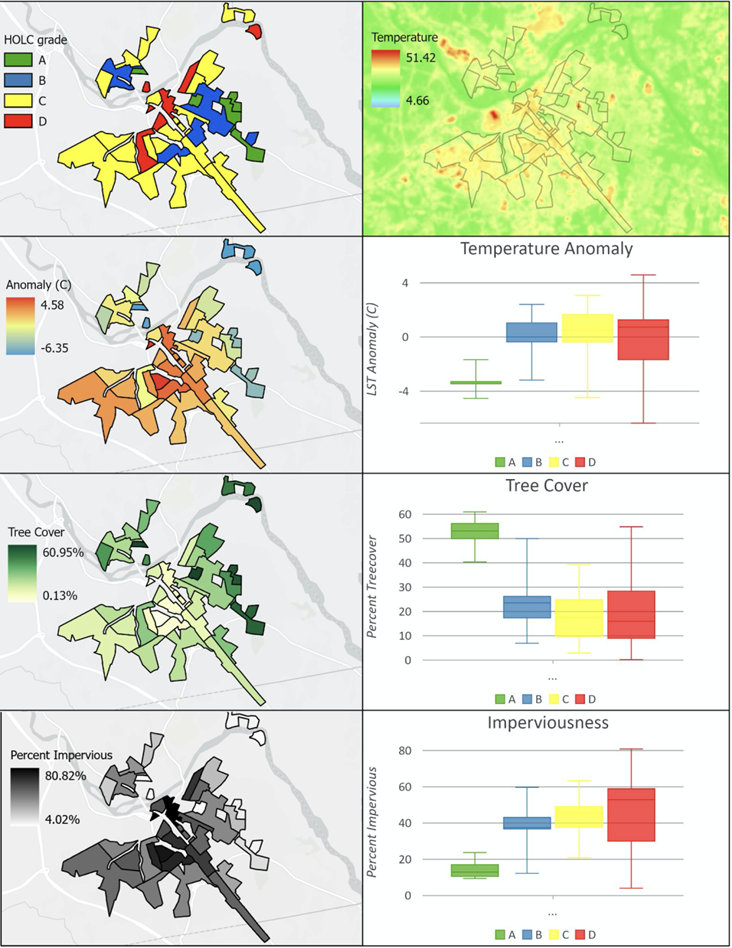
Figure 3: Schenectady. For explanations and sources of each subfigure, see Figure 2 caption.

Figure 4: Troy. For explanations and sources of each subfigure, see Figure 2 caption.
4. Discussion
In their study of 108 redlined American cities, Hoffman et al. (2020) found that the average difference between temperature in A and D blocks was 2.6 °C, but they observed a range of +7.1°C to -1.5°C for temperature differences. All three of our cities fit within this range, with Albany directly on the national average, Schenectady being a more extreme example and Troy’s pattern being the opposite of the expected result. Hoffman et al. (2020) found that in 94% of the cities they studied, D blocks had a higher average temperature than A blocks, meaning Troy corresponds with the 6% of cities that show the opposite pattern.
A few examples highlighted the relationship between HOLC grade, temperature, and tree cover. Albany’s hottest neighborhood, a C-grade block labelled as North Albany, had an average temperature 2.77°C higher than the city’s average. Its tree cover was 19.43% and its imperviousness was 51.19%. The South End, a D-graded neighborhood that has been the center of environmental justice activism in the city, had a temperature anomaly only slightly lower: 2.64°C above the city average. The neighborhood’s tree cover was lower than North Albany’s at 15.18%, and its imperviousness was higher at 55.56%. The fact that the South End had a higher imperviousness and lower tree cover but a lower temperature than North Albany shows that the relationship between the three variables is not linear.
In Schenectady, the only A-graded block at the center of the city is the neighborhood adjacent to Union College. It is referred to as “the city’s most exclusive residential neighborhood” on the original HOLC map (Nelson et al., 2021). This neighborhood had a temperature anomaly of 3.45°C below the city’s average, 6.52° cooler than the D-graded neighborhood just a mile and a half away. The neighborhood around the college has a tree cover of 56.19% and an imperviousness of only 10.05%.
In Troy, the unexpected pattern of cooler D blocks is reflected in the fact that one of the coolest neighborhoods in the city is actually D-graded. This neighborhood, centered around a factory when the HOLC map was made, is now part of the town of Wynantskill (Nelson et al., 2021). Its average temperature is 3.19° below the city average, its tree cover is 40.78%, and its imperviousness is 32.52%. Downtown Troy has especially high impervious cover, 80.67% in one neighborhood that has a tree cover of only 3.96%. This neighborhood was C-graded, and its high imperviousness is related to the highway that runs through it.
5. Conclusion
Our study of Albany, Schenectady, and Troy supplements Hoffman et. al.’s (2020) analysis of 108 urban areas with three more investigations into the relationship between HOLC’ maps and LST. The HOLC redlined a total of 239 American cities, meaning that there are many more that need to be studied in this regard. The data analysis outlined in our methods could be automated in an interactive map or tool to show how LST, tree cover, and imperviousness vary for neighborhoods in all of these cities.
Since this is a relatively new area of study, much is still to be learned about the relationship between redlining and urban environmental factors. We only studied the three variables of surface heat, tree cover, and imperviousness. Land surface temperature is likely not the only environmental factor important to human health with visible differences between HOLC blocks. Other variables to study could include air quality, water quality, and distance to the nearest park.
Additionally, this study can only find the correlation between redlining and heat islands and gives no indication of causation. One question is if the heat effects we saw were actually related to neighborhoods being redlined, or were only due to their downtown locations. One helpful study could be to compare urban heat in cities that were redlined versus cities for which an HOLC map was never made. One could investigate whether downtown neighborhoods with high minority populations have higher surface heat even if they were not redlined.
This study, in addition to the previous work of Hoffman et al. (2020) makes clear that the discriminatory practices of redlining have had serious effects on American cities today. However, the connections between tree cover and temperature show that the problem of urban heat islands is not an unsolvable one. With investments in green infrastructure that are made with grassroots community support, neighborhoods can become greener, cooler, and healthier for their inhabitants.
Author(s) Summary
Acknowledgment
This research was completed as a project in the course Mastering GIS, taught by José A. Constantine, Assistant Professor of Geosciences at Williams College, USA in Spring 2021.
References
Anandababu, D., Purushothaman, B. M., & Suresh Babu, S. (2018). Estimation of Land Surface Temperature using LANDSAT 8 Data. International Journal of Advance Research, Ideas and Innovations in Technology, 4(2), 10.
Hamstead, Z. A., Kremer, P., Larondelle, N., McPhearson, T., & Haase, D. (2016). Classification of the Heterogeneous Structure of Urban Landscapes (STURLA) as an Indicator of Landscape Function Applied to Surface Temperature in New York City. Ecological Indicators, 70, 574-585.[Google Scholar] [CrossRef]
Hoffman, J. S., Shandas, V., & Pendleton, N. (2020). The Effects of Historical Housing Policies on Resident Exposure to Intra-Urban Heat: A Study of 108 US urban areas. Climate, 8(1), 12. [Google Scholar][CrossRef]
Nelson, R. K., LaDale, W., Richard M., Nathan, C. (2021). Mapping Inequality. American Panorama. University of Richmond Digital Scholarship Lab. Retrieved October 28, 2022, from [Website]
Nowak, J. & Greenfield, J. (2018). Declining Urban and Community Tree Cover in the United States. Urban Forestry & Urban Greening, 32, 32-55. [Google Scholar] [CrossRef]
Ramsay, E., Duffy, A., Burge, K., Taruc, R., Fleming, M., Faber, A., & Chown, L. (2023). Spatio-Temporal Development of the Urban Heat Island in Socioeconomically Diverse Tropical City. Environmental Pollution, 316(1), 120443. [Google Scholar] [CrossRef]
Ullah, N., Siddique, M. A., Ding, M., Grigoryan, S., Khan, I. A., Kang, Z., & Zhang, Y. (2023). The Impact of Urbanization on Urban Heat Island: Predictive Approach Using Google Earth Engine and CA-Markov Modelling (2005–2050) of Tianjin City, China. International Journal of Environmental Research and Public Health, 20(3), 2642. [Google Scholar] [CrossRef]
Voelkel, J., Hellman, D., Sakuma, R., & Shandas, V. (2018). Assessing Vulnerability to Urban Heat: A Study of Disproportionate Heat Exposure and Access to Refuge by Socio-Demographic Status in Portland, Oregon. International Journal of Environmental Research and Public Health, 15(4), 640. [Google Scholar] [CrossRef]
U.S. Census Bureau. (2010). Troy (City), New York, Population (2010). United States’ Census Bureau. Retrieved October 16, 2022 [Website]
About this Article
Cite this Article
APA
Kirk-Davidoff R. & Wiggers L. (2023). The Impacts of Redlining on Urban Heat in New York’s Capital District. SustainE. 1(1), 29-39. https://doi.org/10.55366/suse.v1i1.2
Chicago
Kirk-Davidoff, Rosa, and Lucia Wiggers. “The Impacts of Redlining on Urban Heat in New York’s Capital District.” SustainE 1, no. 1 (May 1, 2023): 29–39. https://doi.org/10.55366/suse.v1i1.2
Received
10 April 2022
Accepted
15 February 2022
Published
25 April 2023
Corresponding Author Email: lcw3@williams.edu
Disclaimer: The opinions and statements expressed in this article are the authors’ sole responsibility and do not necessarily reflect the viewpoints of their affiliated organizations, the publisher, the hosted journal, the editors, or the reviewers. Furthermore, any product evaluated in this article or claims made by its manufacturer are not guaranteed or endorsed by the publisher.
Distributed under Creative Commons CC-BY 4.0
Share this article
Use the buttons below to share the article on desired platforms.

